How to Make a Box Plot in Google Sheets

Table of Contents
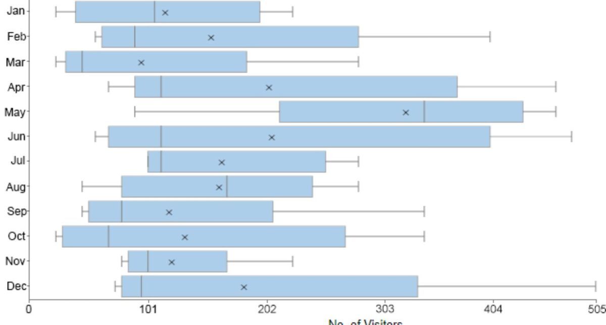
A box plot makes it super easy to visualize data across datasets and make comparisons possible as they show median, upper and lower quartiles, minimum and maximum values, and any outliers in the dataset. This guide will act as a quick guide on how to make a box plot in Google Sheets, and if you’re looking for a more comprehensive course to learn more, you can always attend a course and receive microcredentials after completion.
Not only that, We have more guides you can check out on Google Sheets! Outliers can reveal mistakes or unusual occurrences in data. So if you are wondering How to Combine First and Last Names in Google Sheets?, do not worry! It’s easy, fast and usable.
So, What is a Box Plot?
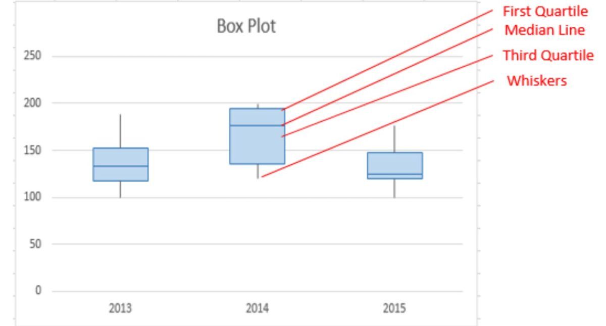
A box plot, also known as a box, whiskers plot, and candlestick chart, graphically represents data based on four quartiles. These one-quarter data sections are in the shape of a rectangle with two extended lines from the short side of the rectangle.

Elements of a typical box plot:
A typical box plot on Google Sheets includes the first quartile, which is the median result depicting the lower half of numerical data outcomes. The third quartile is the result from the upper half of outcomes, while the median is the value of a dataset. While the minimum or 0th percentile is the lowest result and the maximum or 100th percentile denotes the higher result in a numerical data set. Interquartile range refers to the difference between the first and third quartiles.
Pros of Using a Box Plot
Used mostly in analytics and deriving statistics, box plot offers many advantages.
- Visual summary in a dataset made easy: It becomes super easy to quickly review data and how it’s affecting other elements. By creating a single visual plot, not only reviewing data becomes easy but also updating or editing it leaves little to no room for error.
- Illustrated outliers: Unlike calculation techniques, such as find-out means, there are visual outliers in a whisker plot. It makes data readable, apprehensible, and presentable for quick understanding, response, and formulating action plans.
- Comparison between multiple datasets made possible: A typical box plot makes it easy to compare data sets. Generating a visual graph for each dataset makes it easy to compare as data shows up on a single plot.
- Another benefit is that the width or narrowness of the box plot, the partition between the box and the whiskers projects how skewed or symmetrical their data is. This helps make changes accordingly.
- They are very handy in designing digital certificates as well
These features make bringing out scientific research or formulating statistics easy, error-free, and attractive way.
So the Biggest Question – How to Make a Box Plot in Excel?
Making a box plot in Excel is not that challenging. Having said so, there isn’t a box plot generator in Excel, but a few simple steps can help create the plot easily.
Steps to create a typical box plot:

#1 Data Entry
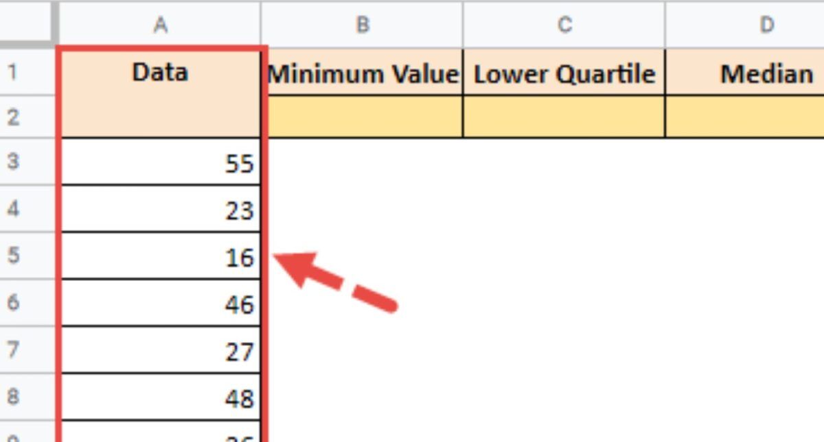
Like any other Excel-related work, data entry is the first sheet. Data is entered in rows for easy access in the process later. It will become the basis of the box plot template, so ensuring the data is correct and complete is necessary before we continue to other steps.
#2 Setting up Quartile Values
Once data is all ready and in rows, we need to calculate values for the box in Excel. For that, value functions are easily available in Excel, so we don’t have to add them manually. These values include:
- Minimum function, MIN(cell range)
- Maximum function, MAX(cell range)
- First quartile function, QUARTILE.INC(cell range, 1)
- Median function, QUARTILE.INC(cell range, 2)
- Third Quartile function, QUARTILE.INC(cell range, 3)
Ensure not to overwrite your earlier data while using these function values for your data on the Excel sheet.
#3 Calculating the Quartile Differences
Calculating the quartile difference illustrates what scale the Excel box plot will be. To do so, place the data in a third column and do calculations using the cell number in place of the value listed with the help of the following function:
- (First quartile) (Minimum)
- (Median) (First quartile)
- (Third quartile) (Median)
- (Maximum) (Third Quartile)
#4 Formulating a Stacked Column Chart
This determines how your box plot will start. You need to select
A stacked column start is how to create a box plot in Excel. Well, it’s Insert Stacked Column Chart from the Column Chart options when you click the Insert tab. Once done, just right-click the new chart and edit to add the values.
#5 Converting Stacked Queue Chart to a Box Plot
This is the final step! In order to make a box plot in Excel, we need to convert the stacked column chart. The steps include:
- Select Format and choose the No Fill option to remove the bottom of the column.
- Click Design and navigate to the Standard Deviation option.
- Once you click on the deviation option, adjust the Error Cap to No Cap. Set the error percentage to 100.

Conclusion
Here is our quick guide on box plots in Excel! Hence, the answer to your question of how to make a box plot in Google Sheets is revealed! Easy, no?


