How to Create an Illustration System for Your Brand

HOW TO CREATE AN ILLUSTRATION SYSTEM FOR YOUR BRAND: A TINY GUIDE BASED ON EXPERIENCE
Well, I have been having such a good time designing new social media posts or any other visual, but there was something inside my head saying that I should be designing in a completely unique way. Every single element that I use in my design should have been made by me, even if it is just a little rectangle. So, I decided to create an exclusive illustration system that I can use in any design.
SO… WHAT IS AN ILLUSTRATION SYSTEM?
An illustration system is basically a collection of illustrations which you can mix-n-match different components and create the most suitable combination for your design. The best thing about illustration systems is that they are fully customizable, which allows you to express your brand’s visual identity in illustrations.
Different illustration systems may adopt different component groups. It basically depends on the purpose of the illustration system. Human bodies, devices, background blobs, plants, furniture, and other decorative shapes are the most common component groups that I’ve encountered.

HOW DID I CREATE ONE?
This is not a question that can be answered in one shot. I do not think that there is a strict guideline to create an illustration system, so I did it in my own way. I guess, the way I did it is consistent and clear enough, so anyone can follow the steps that I am going to talk about.
Let’s get started!
STEP 0: FEED YOUR CREATIVENESS
Not just while creating an illustration system, it is always a good choice to feed your creativeness. Even if you are the greatest graphic designer in the universe -which I am not-, there is nothing you can do if you do not have any inspiration in your mind. Your talent? It does not matter without inspiration. So, you should always be seeking for inspiration in anywhere. On social media, blogs, while going for a walk, or just staring at the wall. How to Create an Illustration System for Your Brand
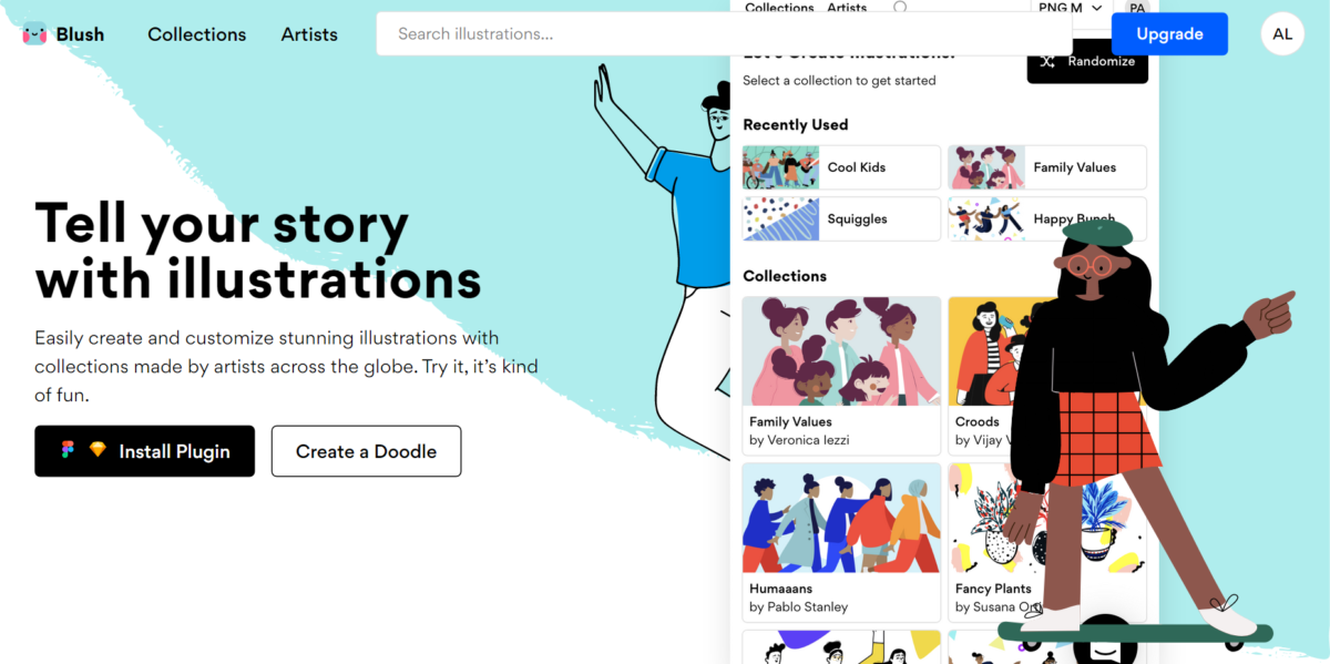
Besides those fancy words, where did my inspiration come from? I was watching a random live session on Behance, then I met Pablo Stanley and his illustration systems. Then, I dug into his portfolio and boom! I was inspired by his work! With a “I can only draw a stickman” point of view, it was mesmerizing to be able to create incredible illustrations using a professional’s illustration system. I did use his work, such as Open Peeps and Humaaaans, and it was a huge time-saver! If you have no budget, time or talent for an illustration system, you can use blush.design (founded by Pablo Stanley) and choose between lots of different illustration systems created by professionals to use in your social media, or projects. It’s free and easy to use and you don’t have to attribute!
STEP 1: UNDERSTAND YOUR BRAND’S IDENTITY
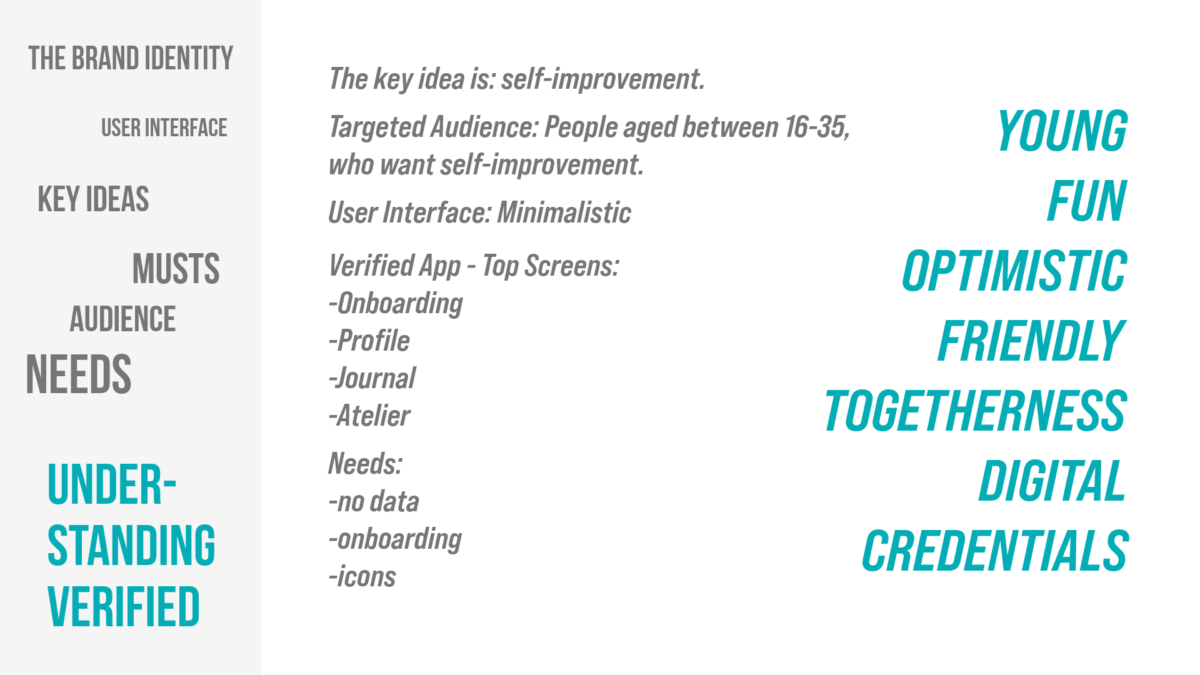
In this step, you should take a look at your brand more closely. The first question you should ask: What is the key idea behind your project/brand? The key idea is the best starting point to understand your brand’s identity. Once you get the key idea, you should look into the targeted audience, user interface, and previous social media posts. Also, you should decide where your illustration system is going to be used and what are the needs. These will help you create a meaningful background before you start developing a visual identity for your illustration system. You shouldn’t just use random doodles if you want to create a suitable and meaningful illustration system for your brand.
STEP 2: DEVELOP A VISUAL IDENTITY FOR YOUR ILLUSTRATION SYSTEM
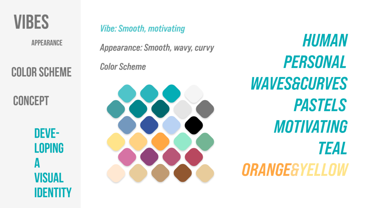
Once you’re done with the understanding process of your brand’s identity, you can start creating a visual identity that will reflect your brand’s identity. You may start with a basic question here: What vibes do I want to get from looking at my illustration system? In the context of Verified, my answer was “smooth and motivating”. To create a “smooth and motivating” vibe, I told myself that I should be using smooth, wavy, and curvy elements. Then I moved on with creating a color scheme within the “smooth and motivating” boundary. You may consider making a list of keywords that will basically express your visual identity. You can see mine below:
STEP 3: FINALIZE IDEAS
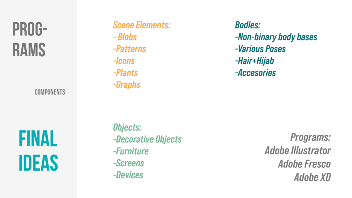
You are now done with understanding your brand’s identity and creating a visual identity, which means you have the minimum background knowledge to decide what your brand needs. First, you may write down your needs randomly, and put them into groups to see them clearly. Putting them into groups will help you make a nicely organized working process and illustration system at the end. In this step, you should also look for tools which you’re going to use. I used Adobe Fresco to doodle my ideas, Adobe Illustrator to draw components, and Adobe XD to build the illustration system. I also used Adobe XD for previous steps, so you may consider using a tool like Adobe XD to amplify your thinking process.
STEP 4: DRAW WHAT YOU NEED!
This step is the best part of building an illustration system, but also a painful one. It took me two days to figure out the drawing style. If you can’t figure out how you’re going to draw, just wait and Pinterest yourself for a while, and doodle anything like lines, individual shapes, dots and so on. At the end, the ideas will grow up, and you will come up with a perfect drawing style. Also a friendly tip: Try to keep it simple. Thinking in a complicated way will exhaust your brain and may wipe up your inspiration.
Once you come up with your perfect drawing style, you should doodle everything in the first place. If you decided to draw humans, you may consider drawing them in different poses. I used Adobe Fresco on iPad for my doodles.
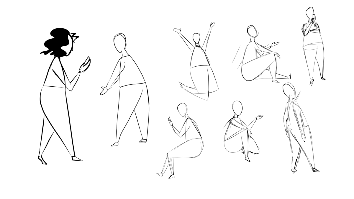
When you finish doodling, you can move on to Adobe Illustrator to start creating the real elements of your illustration system. The reason why I used Adobe Illustrator is vector images are always the perfect fit. Import your doodles into your workspace and start drawing over your doodles. Copying yourself will help you with time management. When you finish an element, let’s say, a single body, start colorizing. In this step, you will figure out if your color scheme is suitable or not. Also, a friendly tip here: Create a CC Library for your color scheme. In this way you can easily access your color scheme on different programs.
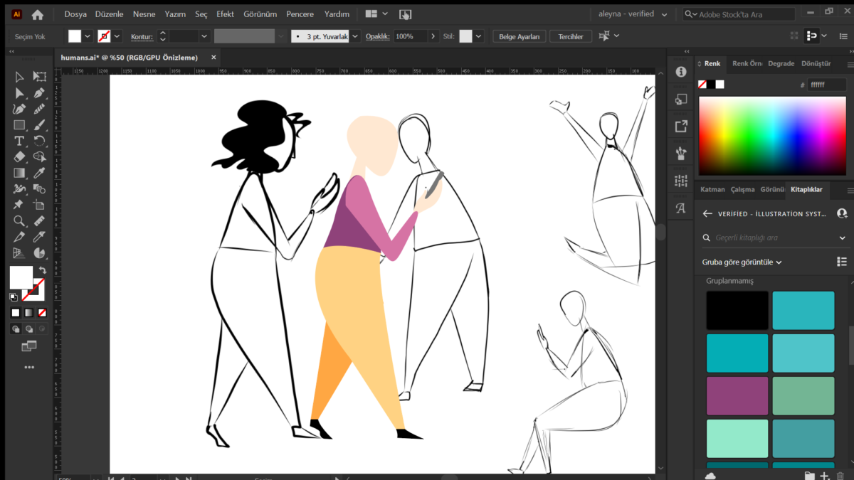
If you’re okay with the result, all you have to do is to keep drawing and colorizing components.
STEP 5: BUILD YOUR ILLUSTRATION SYSTEM
When you finish drawing components, you can move on to Adobe XD to build a complete illustration system. Before you start importing your elements from Adobe Illustrator to Adobe XD, you should make a guideline for people who are going to use the system. At this point, you can consider these questions:
- How to combine elements?
- How to customize the colors?
- Where can I find the color scheme?
- How to export my customized illustration?
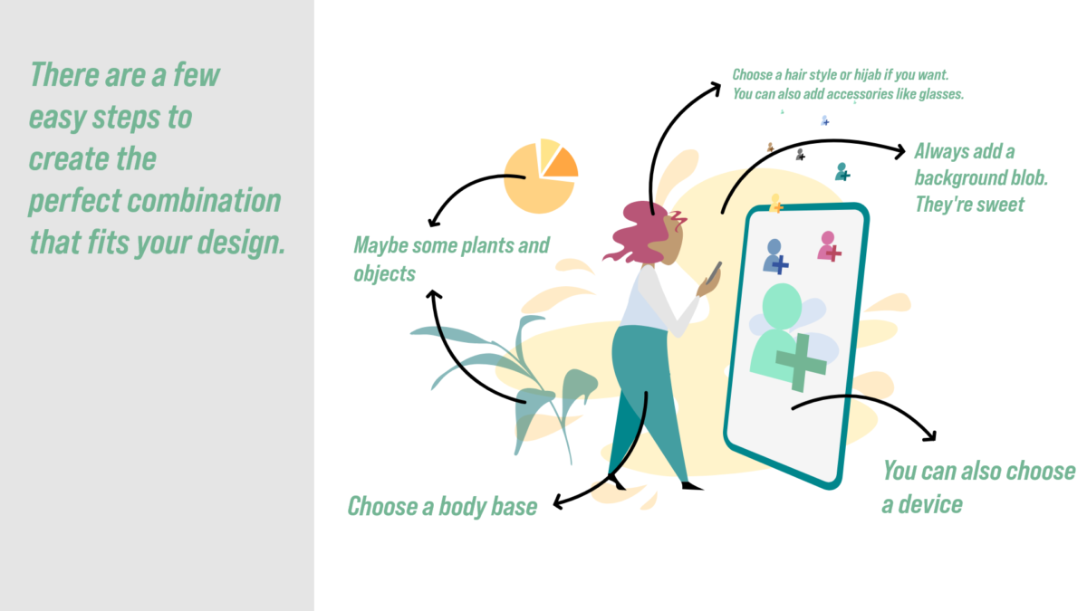
Once you finish the user’s guide, you can start importing your elements into XD. You should just copy the elements from Illustrator and paste them into XD. Before doing that, you can create various artboards to create sections for each element group. I organized my illustration system as you can see below:
- Bodies
- Bodies – Special
- Bodies & Vehicles
- Hair & Accessories
- Background Blobs
- Plants
- Graphs
- Devices
- Combinations
- And icon sets.
After finishing importing and organizing elements, don’t forget to import your color scheme into assets. It will make it easier to access color codes. You might give a special name for each color.
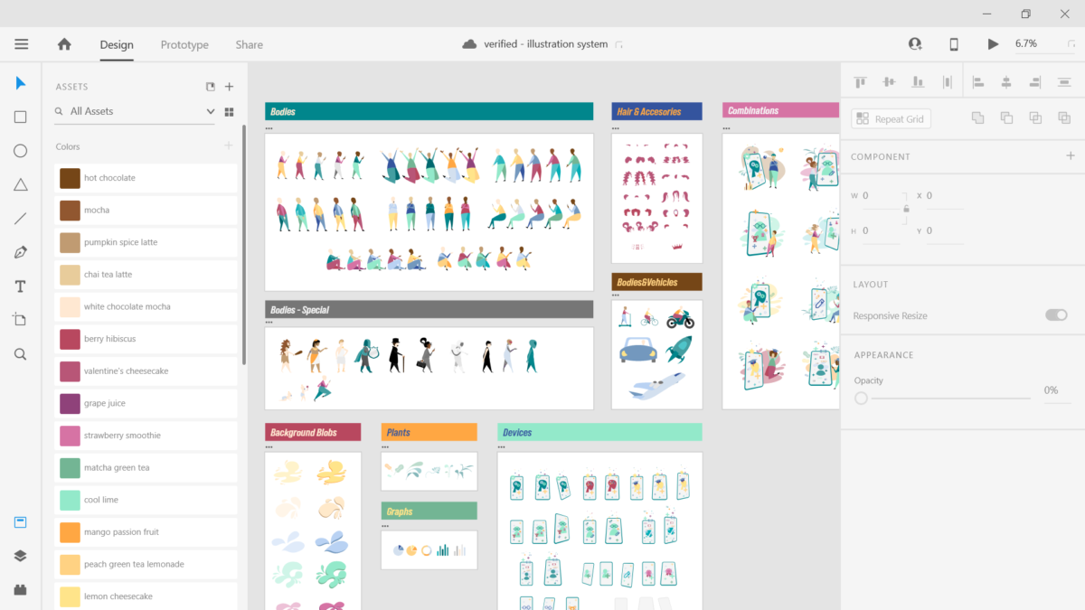
Congrats! You’ve built an incredible, fully customizable and dynamic illustration system exclusively for your brand. Now you can play with elements, create dynamic scenes, and amplify your brand’s visual presence on social media or anywhere! If you’d like to add something or talk about your experience, just send an e-mail to aleyna@sertifier.com. Cheers!


