8 Steps To Effective Certificate Design

Contents
- Identify the Purpose
- Choose a Size and Orientation
- Select a Color Scheme
- Choose Fonts
- Add Graphics
- Include Essential Information
- Use Hierarchy and Layout
- Print and Distribute Certificate Design
Certificate design is an important aspect of any training program or event, as it serves as a tangible reminder of the accomplishment and recognition of the participants’ efforts. The design of a certificate can greatly impact its perceived value and significance, as well as its ability to inspire and motivate individuals to continue their learning journey.
Users can create various types of certificates, including attendance certificates, diplomas, and more, to recognize different achievements.
In this article, we will discuss eight essential steps to creating effective certificate designs that are visually appealing and professional-looking. You can browse and search through tons of free certificate templates, or start from scratch to personalize your own design, all in one place. Many platforms offer free access to certificate templates and design tools. Create digital badges and accurately reflect the accomplishments they represent. By following these steps, you can ensure that your certificates not only look great but also effectively communicate the importance and value of the achievement they represent.
Introduction to Certificate Creation
Creating certificates is a powerful way to recognize and celebrate the achievements, hard work, and contributions of individuals in any setting. Whether you’re marking the completion of courses, acknowledging participation in events, or expressing gratitude with a certificate of appreciation, certificates serve as lasting proof of accomplishment and recognition. Thanks to a wide variety of certificate templates and easy-to-use certificate generators, anyone can now create their own certificates without needing advanced design skills. From award certificates for top performers to personalized certificates for course completion, the right template can help you design professional certificates that reflect your organization’s style and values. With customizable templates, you can tailor each certificate to the specific achievement, making every recognition moment truly special for individuals and teams alike.
Identify the Purpose
Identifying the purpose of the certificate design is the first and most important step in designing an effective certificate. This helps to determine what the certificate will recognize and what message the design should convey. Understanding the purpose will also guide the choice of appropriate colors, fonts, and graphics to use in the design. The purpose of the certificate could be to recognize academic achievements, professional accomplishments, or participation in an event or program, among others. By identifying the purpose of the certificate, you can create a design that is meaningful and relevant to the recipient. A well-designed certificate can also boost motivation and engagement among people who receive it, making them feel valued and recognized.
Choose a Size and Orientation
The second step in designing an effective certificate is to choose the appropriate size and orientation. The standard sizes for certificates are 8.5 x 11 inches or A4 paper size. The size should be appropriate for the certificate and the amount of information that needs to be included. The orientation can be portrait or landscape, depending on the certificate design and the information to be included.
Portrait orientation is often used for formal and traditional certificates, while landscape orientation is used for more modern and creative designs. When choosing the size and orientation, it is important to consider the printing and distribution process as well. The certificate design should be easy to print and distribute to the recipient. By choosing an appropriate size and orientation, the certificate will look professional and visually appealing.
Select a Color Scheme
The third step in designing an effective certificate is to select a color scheme. The color scheme should be consistent with the purpose of the certificate, the organization or event it represents, and the overall design. A limited color palette of two or three colors is recommended to create a professional and cohesive look.
When choosing the color scheme, consider the emotions and meanings associated with different colors. For example, blue is often associated with trust, professionalism, and calmness, while red is associated with passion, excitement, and energy.
It is also important to consider the contrast between the background and the text, as the text should be easily readable. High contrast colors such as black and white, or dark and light shades of the same color, can ensure legibility.
Overall, the color scheme should enhance the certificate design and convey the appropriate message to the recipient.

Choose Fonts
The fourth step in effective certificate design is to choose appropriate fonts. Fonts should be easy to read and appropriate for the certificate. A combination of serif and sans-serif fonts can add interest and clarity to the design.
Serif fonts are often used for traditional and formal designs, while sans-serif fonts are used for modern and minimalist designs. It is important to use a font size that is easy to read and consistent throughout the certificate.
Avoid using too many different fonts or fonts that are difficult to read. It is also important to consider the contrast between the font and the background, as the text should be easily readable. High-contrast fonts, such as black or dark grey on a light background, are recommended for readability.
Add Graphics
The fifth step in designing an effective certificate is to add appropriate graphics. Graphics can include logos, images, icons, borders, or other design elements that enhance the visual appeal of the certificate. Users can also upload their own graphics or backgrounds to further personalize the certificate design.
When choosing graphics, ensure that they are relevant to the purpose of the certificate and do not detract from the text. High-quality graphics that are consistent with the color scheme and design of the certificate can add interest and professionalism to the design.
It is also important to consider the placement and size of the graphics, as they should not overwhelm the text or appear too small to be seen clearly. Graphics can be used to highlight important text, such as the recipient’s name, or to create a sense of balance and harmony within the design.
Include Essential Information
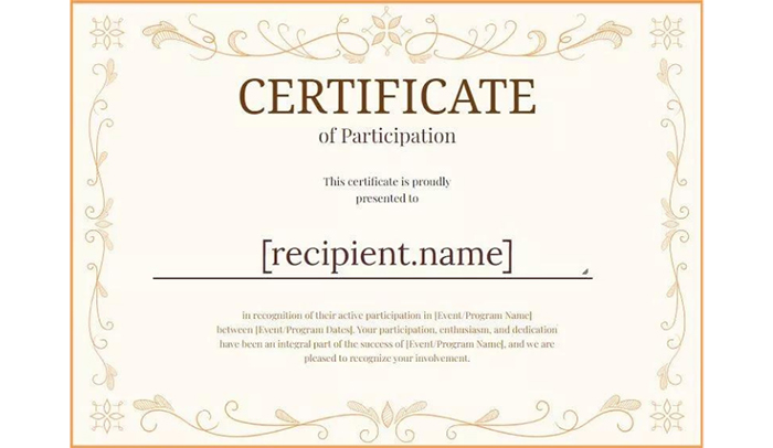
The sixth step in effective certificate design is to include essential information. The information included on the certificate will depend on the purpose of the certificate, but typically includes the following:
- Name of the recipient
- The name of the organization or institution presenting the certificate
- The title of the certificate or achievement being recognized
- The date the certificate was issued
- The signature of the person presenting the certificate or an authorized signatory
Maintaining a list of recipients can help streamline the process of issuing certificates to multiple people, making it easier to organize and manage bulk certificate distribution.
Other information that may be included on the certificate could be the name of the program or event, the name of the instructor or trainer, or the duration of the program. It is important to ensure that all information included is accurate and up-to-date.
When designing the certificate, the text should be easy to read and clearly legible. Use appropriate font sizes and styles to make sure the text stands out and is easy to read.
Use Hierarchy and Layout
The seventh step in designing an effective certificate is to use hierarchy and layout to organize the information. A clear hierarchy and layout will help to emphasize the most important information and make it easy to read and understand.
Hierarchy refers to the arrangement of elements in order of importance. The most important information should be emphasized through the use of larger font sizes, bold or italic text, or placement in a prominent location on the certificate.
Layout refers to the overall arrangement of the elements on the certificate. The layout should be balanced and visually appealing. It is important to leave enough white space to make the certificate easy to read and not overwhelming. You can easily change text, colors, fonts, and backgrounds to create a clear hierarchy and visually appealing layout.
When designing the layout, consider the placement of the text, graphics, and other elements. Group related information together, such as the recipient’s name and the title of the certificate. Use lines, borders, or other design elements to separate different sections and create visual interest.
Security and Verification
Ensuring the security and authenticity of certificates is essential, particularly in the digital age. A secure certificate generator and hosting platform can protect your certificates from tampering and unauthorized access, giving both issuers and recipients peace of mind. Advanced features like dynamic QR codes and verifiable documents add an extra layer of trust, allowing anyone to instantly verify the legitimacy of a certificate with a quick scan. For example, when you create a certificate of appreciation, you can include a unique QR code that links to a secure verification page, ensuring that the certificate is genuine and recognized by your organization. By prioritizing security and verification, individuals and organizations can confidently issue certificates that are both meaningful and trustworthy.
Print and Distribute Certificate Design

The final step in certificate design is to print and distribute it to the recipients. The printing process should be of high quality to ensure that the certificate looks professional and visually appealing. You also have the option to order high-quality prints of your certificates directly from the platform for added convenience.
If you want to create a certificate on your own, you can read our blog on how to create certificates in Word.
When printing the certificates, it is important to use high-quality paper that is appropriate for the certificate. If the certificate is going to be framed, it is best to use a heavier-weight paper that will hold up over time.
After the certificates have been printed, they should be distributed to the recipients promptly. Learn how to create a digital certificate with Sertifier now! This could involve mailing them directly to the recipient or distributing them at an event or ceremony. You can also download certificates in various formats, such as PDF, and save them for future use. Users can share certificates digitally via email or social media, often with a single click, making it easy to celebrate achievements online.
It is also important to keep a record of the certificates that have been issued, including the date they were issued and the recipient’s name. This can help to ensure that all recipients receive their certificate and that there is a record of the achievement or recognition.
If you want to streamline the process of creating and distributing digital certificates, you can use Sertifier. With Sertifier, you can design and issue certificates quickly and easily. Sertifier offers a user-friendly interface and customizable templates, so you can create certificates online that reflect your brand and the purpose of the certificate. Before finalizing and distributing the certificate, you can take advantage of a wide range of customization options, including colors, icons, and templates, to tailor the design to your needs.
You can also easily track and manage the distribution of certificates, ensuring that every recipient receives their certificate promptly. Overall, using Sertifier can make the certificate design and distribution process more efficient and effective!
Check out the credential design flow with Sertifier!
Best Practices and Tips
To create certificates that truly stand out, it’s important to follow a few best practices. Start by selecting a professionally designed certificate template that matches the occasion and your organization’s style. Customize the template with your own text, images, and design elements to make it unique. Use high-quality fonts and images to ensure your certificate looks polished and professional. Adding a personal touch, such as a heartfelt message or a handwritten signature, can make the certificate even more meaningful for the recipient. Before you print or send your certificate, take the time to proofread all the details to avoid any errors. For instance, you might use a certificate template to design a custom award certificate for an outstanding employee, then print it on premium paper for a truly special presentation. By keeping these tips in mind, you can create certificates that are both impressive and memorable.
Conclusion and Next Steps
In summary, creating certificates has never been easier thanks to the wide range of certificate templates and certificate generators available today. Whether you’re recognizing employee achievements, celebrating course completion, or expressing appreciation, you can quickly create professional certificates that meet your needs. With options to customize, print, and send certificates via email, you have the flexibility to choose the best method for your organization or event. As a next step, consider browsing different template options, experimenting with your own certificate design, and exploring the various customization features available. With the right tools and a bit of creativity, you can design certificates that not only look great but also make a lasting impact on every recipient. For example, you might use a certificate template to create a personalized certificate of appreciation and send it directly to the recipient’s inbox or print it for a special ceremony making recognition easy, meaningful, and memorable.
